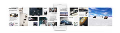
Long Scrolling: Mobile View

We all sit at our laptops all day, so we think about the desktop first. You kind of take your phone for granted. But the first thought should be, "Actually, let me look at it on my phone. How is the phone experience going to be?" (Shopify blog)
Now more than ever, companies need to think “Mobile First”. For the analysts out there, here’s some data to back up this claim:
Simicart, in their article, “Insights from Trending mCommerce Statistics,” wrote the following about smartphones:
- 67% of the global population owned a mobile phone in 2019.
- 79% of smartphone users made online purchases using these devices
- 48% of buyers use mobiles as the dominant device while using a search engine
- 58% of Google searches were done via mobiles
- 65% of clicks on paid Google search results came from mobile devices
So it’s really no surprise that websites with long and infinite scrolling have become common in the past couple of years. Add to it the fact that Google has been heavily favoring mobile-friendly websites since 2015 and then started indexing mobile sites in March 2018.
If you’re wondering about the addictive nature of a mobile site, let us give you a statistical perspective. In 2013, users spent an average of 144 minutes per day consuming data from their desktops in contrast to 88 minutes on mobiles. Jump to 2019, the story has reversed. Mobile users now spent an average of 203 minutes per day whereas desktops were down to 128 minutes per day!
The giants have said it, and we quote “More purchase conversions take place on mobile than on desktop” as of 2019!
As tech partners, we’ve produced multiple websites for industries ranging from agri-tech to health-care! One certainty across all these websites, is the scroll format. Over 99% of the websites that we’ve built have a scroll below the fold on their desktop sites!
Users love it for three reasons:
- It's easy to use
- Messaging is prioritised
- Social media apps have conditioned them to the infinite scroll experience already!

Image source: Lithiosapps’s article
The image above is an example of how the same information is conveyed through different wireframes on different devices. This is called a responsive design - while the same information is available on the devices, the layout is entirely different! These changes may look cosmetic, but believe us when we say, there is a lot that goes on at the back end! If these optimizations are not looked into carefully, it can ruin the promising future of a brand’s digital identity!
But, what makes the long-scroll websites problematic?
Let’s first get the basic out of the way! The desktop real estate is quite obviously humongous as compared to the mobile. According to Abbas Rajani, in his article, “6 Ways to Improve Long-Scroll Mobile Websites” the following problems could crop up if optimization is not implemented correctly:
- Boredom galore with scrolling
Desktops have horizontal elements which when viewed in relatively smaller screen space of a mobile tend to be stacked in a vertical format. This makes your website LONG and breaks the user's interest, resulting in them bouncing to another website. As a brand looking to convert page views to sales, THIS IS BAD.
- Unfriendly Navigation
Navigation is key and when you stuff too much on a smaller screen dimension as of a mobile, it quickly becomes cluttered making it difficult for users to reach their desired destination.
- Hindrance for the Footer Elements
To get from one page to another, especially on an ecommerce website, footer navigations become essential. If a user has to continue scrolling a tremendously long page in the hopes of navigating to other webpages, they’re not having it! Say hello again to users bouncing!
- Slows Mobile Speed
Desktops are more powerful when compared to smartphones and thus have the luxury of being loaded with design elements, however the same does not apply for the latter! Several of these can be given a miss on mobiles but if your long scroll website isn't optimized in that way, it's going to take a longgggg time to load and no one wants that! Campbell Jof, in his article, “8 Challenges Of Website Optimization For Mobile Devices” talks about a few other challenges that one might face!
So, does that mean we abandon all hopes and rue over a lost future?
Absolutely not!
Ignoring the ramifications of long-scroll pages can be a big loss to your business but you can optimize your mobile view while keeping your content intact and here’s how!
- Get rid of the unnecessary
Say goodbye to excess plugins, pop ups, any other screen inhibitors, white spaces, redirects, etc. You have limited space concerning the users’ attention, don't bog it up with extras!
- Remove duplications
Desktops versions often have navigational elements repeated in the footer. On a mobile, this would require the user to continue scrolling till the end. However, you can change this by adding a navigation element right at the top of the website.
- Use horizontal scroll
At times, there will be elements such as multiple images of a product that need to be displayed. Instead of creating a vertical scroll for all images, try an incorporate a horizontal scroll as in Fabian Frey’s article on “The Horizontal Scroll Interface”
Identify Standard Sizes of Popular Mobile Devices
A good strategy here would be to do a market analysis of most popular phones and test mobile optimization using these devices as screen dimensions vary when it comes to different devices.
Check out the iOS and Android screen dimensions of a few smartphones below:
iOS:

Android:

Check out Sasha Sergiienko’s article on “A mysterious density-independent pixel. A quick introduction to Android design.”
- Don't use a scroll as an indicator for success
Scrolling has become second nature. Users don't scroll just because they like your website, they could also just be doing it as a natural habit without being the slightest bit interested in what you have to say or sell. Thus, don't use the data of the number of users reaching the end of your webpage as a sure shot sign that all is going well. Look deeper!
- Get in a few codes
Responsively-designed sites use CSS3 media queries to serve the same content to mobile and desktop users using a fluid grid and a flexible design to automatically adapt to the size of a user's screen. In addition to this, brushing up on the basics of HTML, Liquid or any other coding language can only do you good. Check out what Hartley Brody has to say in his article, “How I Mobile Optimized My Website in 5 Minutes.”
- Incorporate Functional Animation
According to Nick Babich, in his article, “Best Practices for Long Scrolling,” creative elements like parallax scrolling and scroll-activated animations are essential parts of interaction design. They keep the user engaged and wondering what might happen next. However, keep in mind that these will slow down your load time.
So, where does that leave ecommerce?

In Monate’s Q1 2020 analysis, it was seen that ecommerce conversions globally were about 55% higher on a desktop than on a mobile phone.
Confused?
We’re sure right about now you’re wondering, “If mobiles are being used more for viewing websites, how are the ecommerce stats so contradictory?”
The answer lies in two words; Mobile Applications
According to Mango 360, Mobile app users spend an average of 201.8 minutes per month shopping, compared to 10.9 minutes/month for website users” With major players in the market like Amazon, Myntra, Flipkart all lobbying for the number one position, most ecommerce sales take place through these applications.
Does that mean you need two versions of your website; desktop and mobile and a mobile app?
Yes and no.
The future of ecommerce is quickly evolving into mobile applications. However, this does not make a website redundant. The likelihood of users downloading your app (if you do make one) depends entirely on whether they trust your brand or not. This is where websites have an upper hand. It forms the backbone of customer loyalty. An app could be the end goal but making it a paving stone is a very risky decision.
Conclusion
For a website, the UX means everything and long scrolling can create a completely immersive browsing experience. We’re currently in the middle of a tech boom and everyone is on level grounds! Upping your game and competing against the competitive market using creativity, market analysis, and a futuristic perspective is what will make your brand stand out! The Daily Egg, in their article, “How to Optimize Copy for a Better Mobile Experience” talks about a few ways you can take your content game one step higher!
Therefore, to go the long scroll or not is no longer the dilemma.
The question today is, “how can a long scroll website be better optimized for a smartphone”